
Why Kano, why now?
As Product Owners, we juggle a backlog of ideas, requests, and “must‑haves.” Traditional prioritization matrices force everything into a single value column, while Kano Analysis provides a richer dimension: how customers feel when a feature appears (or doesn’t).
In a single survey, you learn which items delight, which merely satisfy, and which silently erode trust. Given my focus over the past few weeks on data and analytics, I thought I would try a Python program using real customers’ data (translating it to my example as best I can to protect the innocent, LOL).
Let’s dive into our required files and how we will use them; I assume you are familiar with the process and have tweaked it a bit, but see our link above for the process itself if Kano is new to you.
Our Kano Descriptors:
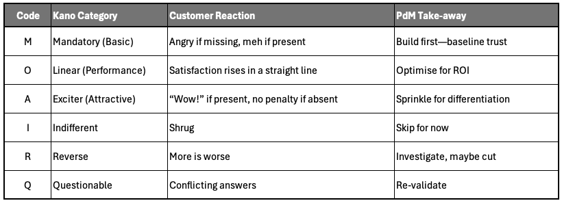
Kano also yields two quick health metrics: Satisfaction Index =(A+O)/(A+O+M+I+R) and Dissatisfaction Index =‑(M+O)/(A+O+M+I+R). Think of them as potential lift vs potential landmine.
Spin up a Scorer in Minutes
First let's discuss our sample product: Car Dealership Deal-Manager. The quick and dirty of this product example:
QuickDeal: Our goal is to streamline every step of a vehicle sale, from the first customer inquiry to the final contract signing, so that dealership staff can spend less time on paperwork and more time selling and meeting our customers’ needs.
So, Who Are Our Customers?
- Sales Reps who need real-time pricing, trade-in estimates, and an easy way to compare deals on the showroom floor.
- Finance & Insurance (F&I) Managers who need integrated credit checks, insurance quotes, and upsell recommendations without switching systems.
- Service Coordinators who schedule follow-up appointments and warranty work.
- Dealership Executives who track pipeline health, profit margins, and compliance status.
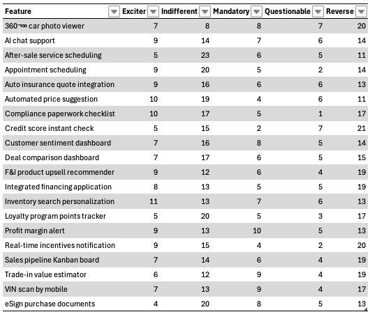
The 20 Sample Features for Analysis
Each row in survey.csv represents how a fleet of real users (sales, F&I, service, management) reacted to these candidate capabilities in our survey:
| Feature | Who Cares? | What It Does |
| Automated price suggestion | Sales Reps | AI-driven MSRP vs. market-value suggestions |
| Trade-in value estimator | Sales Reps | Instant estimates based on VIN and condition |
| Integrated financing application | F&I Managers | Submit credit apps without leaving the app |
| Credit score instant check | F&I Managers | Pull credit data as soon as SSN is entered |
| Appointment scheduling | Service Coordinators | In-app calendar for test drives & service |
| Inventory search personalization | Sales Reps | Filter cars by features customers love |
| eSign purchase documents | All roles | Digital signatures on contracts & addenda |
| 360° car photo viewer | Marketing/Online Sales | Interactive car previews in the showroom |
| Loyalty program points tracker | Sales & Marketing | Show points balance & rewards in real time |
| Real-time incentives notification | Sales Reps | Pop-up deals & rebates based on inventory |
| VIN scan by mobile | Sales Reps | Scan VIN barcode to auto-fill vehicle details |
| AI chat support | All roles | On-demand chatbot for quick policy questions |
| Deal comparison dashboard | Executives | Side-by-side deal metrics for negotiation |
| Profit margin alert | Executives | Flags any deal below target margin |
| Compliance paperwork checklist | Managers | Step-by-step guide to legal/finance docs |
| After-sale service scheduling | Service Coordinators | Book maintenance follow-ups automatically |
| Sales pipeline Kanban board | Sales Managers | Visualize deal stages & blockers |
| Customer sentiment dashboard | Marketing | Aggregate NPS & feedback from test drives |
| Auto insurance quote integration | F&I Managers | Instant third-party quotes inside app |
| F&I product upsell recommender | F&I Managers | Suggest add-ons (GAP, extended warranty) |
Use this context together with the survey results to:
- Share with new team members so they understand the domain.
- Frame your stakeholder prioritization meeting (“Here’s who said what and why it matters”).
- Align every sprint to customer-facing objectives and release timing (use themes / epics / etc...).
Below is a trimmed‑down version of the python script (Kano.py) built to support the survey data.
pip install pandas
python kano_report.py  # will ask you to pick a CSV
# kano_report.py  ▸ minimal edition
import pandas as pd, tkinter as tk
from tkinter import filedialog
KANO_MAP = {  # (functional, dysfunctional) ➜ code
   ("Like", "Dislike"): "A", ("Must-be", "Dislike"): "M",
   # …full Berger lookup omitted for brevity…
}
def choose_file():
   root = tk.Tk(); root.withdraw()
   return filedialog.askopenfilename(title="Select Kano survey CSV")
def classify(df):
   df["category"] = df.apply(
       lambda r: KANO_MAP[(r.functional_response, r.dysfunctional_response)], axis=1
   )
   return df
def score(group):
   total = len(group)
   pct = group.category.value_counts(normalize=True)
   dominant = pct.idxmax()
   sat = (pct.get("A",0)+pct.get("O",0)).round(3)
   dissat = -(pct.get("M",0)+pct.get("O",0)).round(3)
   return pd.Series({"Dominant":dominant,"Sat":sat,"Dissat":dissat,**pct})
if __name__ == "__main__":
   path = choose_file()
   raw = pd.read_csv(path)
   report = classify(raw).groupby("feature").apply(score).fillna(0).reset_index()
   report.to_csv("kano_report.csv", index=False)
   print(report[["feature","Dominant","Sat","Dissat"]].to_string(index=False))
The input CSV File needs four columns for this script (case‑sensitive):
- Columns: respondent_id, feature, functional_response, dysfunctional_response
- Responses: Use the five Kano words: Like, Must-be, Neutral, Live with, Dislike.
If you peer into the raw scoring data, it looks like this:
Using the output in a stakeholder meeting
Start with Mandatory Features. Anything with Dominant = M plus a Dissatisfaction Index below ‑0.5 is non‑negotiable. Lead with risk: “If we skip VIN‑scan our trust score plummets.”
Quantify the Performance levers. Linear (O) items become negotiation chips. Combine Satisfaction Index with effort/ROI to craft slices: “These two features deliver 60 % of the possible satisfaction lift for only 20 % of the sprint capacity.”
Add one Exciter. A single high‑A feature can turn a stable release into a press‑worthy moment. Use it as the finale of your story map.
Defuse Reverse & Indifferent. If Reverse surfaces, ask why more of the feature is a turn‑off. Indifferent usually means “good idea, wrong time”, park it and save capacity.
Flag Questionables for discovery. A double‑digit Q‑rate signals survey confusion. Schedule quick interviews before burning the time to develop them or discard them.
The Heat Map Visuals
Pairing a heatmap with the underlying Kano data transforms a spreadsheet of numbers into a single, shared visual story, which is ideal for alignment meetings. Stakeholders instantly see which features cluster as “must-haves,” which drive ROI, and which spark delight, without wading through raw percentages. This dual presentation, bright color bands alongside precise Satisfaction and Dissatisfaction indices fosters faster, data-driven conversations, reduces debate over assumptions, and empowers everyone from executives to engineers to agree on what to build (and what to cut) in the next sprint.
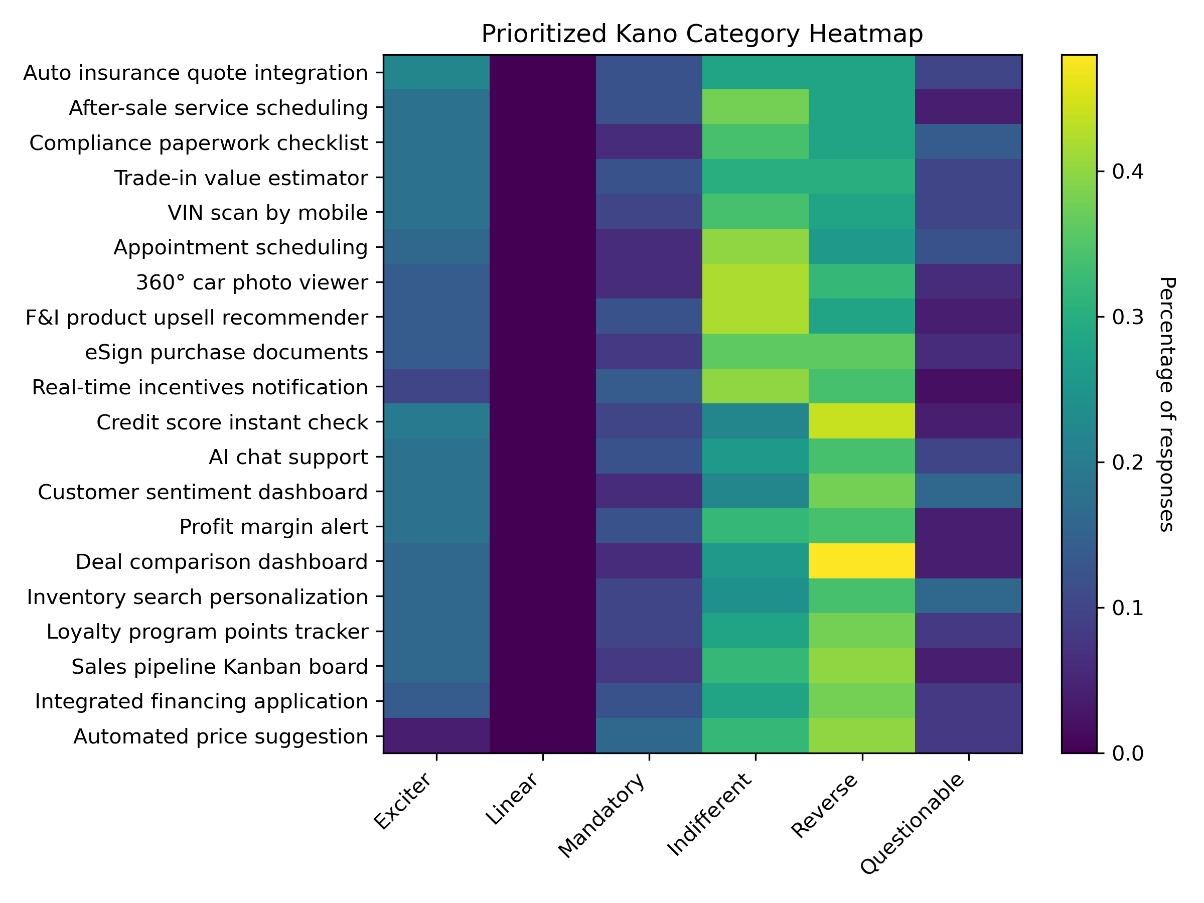
Of course we have to teach our stakeholders how to use / read this heat-map, so here is my advice:
- Scan left‑to‑right: Dark vertical bands show where perception clusters. A tall dark stripe in Mandatory tells you the “table‑stakes” story in one glance.
- Hunt the green zone: Cells with high Exciter or Linear values are your growth levers. If “AI chat support” glows in the Exciter column, that’s your buzz feature.
- Spot the risk: Bright colors in Reverse mean “doing more annoys users.” Perfect ammo to push back on pet features.
- Ignore the beige: Grey or pale rows across the board? That feature is Indifferent—drop or bundle later.
- Validate the noise: A speckled Questionable column = survey confusion. Park for discovery interviews before committing code.
How to use this in the stakeholder meeting:
- Open with the heat-map slide – pictures trump tables, and everyone gets the gist in seconds (you can probably create a more visually appealing heat map, but this is a good start programmatically).
- Tell the story:: “Left side = must‑haves, middle = ROI levers, right side = delight or landmines.”
- Back it up with numbers – flip to the CSV for Satisfaction & Dissatisfaction indices when budget questions arise.
- Close with a proposal – “Ship the three Mandatories, fund the top two Linears, add one Exciter for launch buzz.”
Why Python beats spreadsheets
- Repeatable – swap in next quarter’s survey and rerun in seconds.
- Auditable – the mapping table is visible, no hidden formulas.
- Extensible – add plotly charts, merge NPS or cost data, even push results straight to Jira / Azure Boards.
- Shareable – stakeholders can run it locally; no proprietary tooling needed.
Ready to try?
- Grab the full Kano scorer (with heat‑map plotting and satisfaction curves) on GitHub: github.com/big‑agile/kano‑toolkit
- Download a 20‑feature sample dataset to practice (survey.csv).
- Remember: Data won’t decide for you—but it gives you the credibility to say “no” to the wrong work and “yes” to value that matters.
Happy prioritizing!