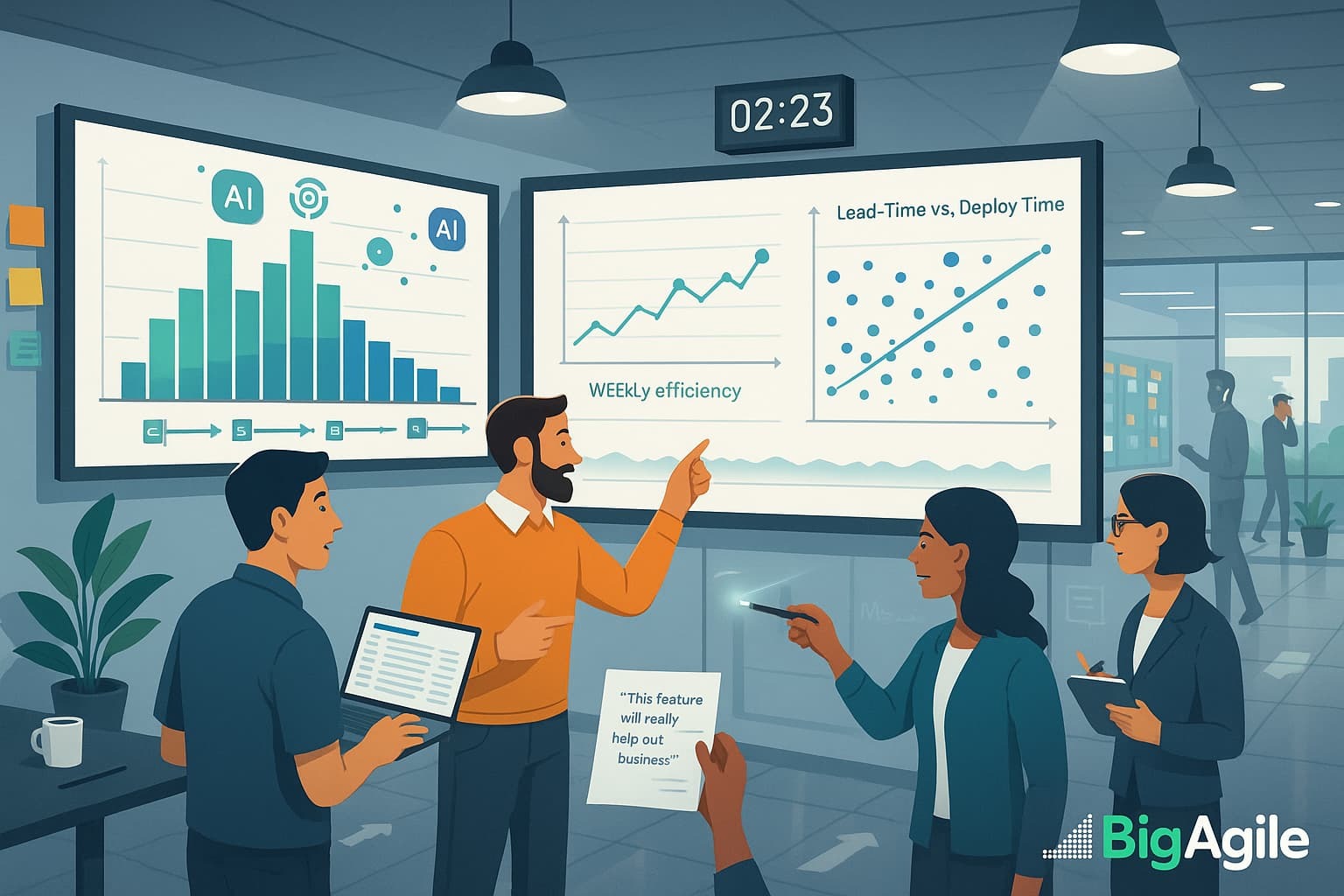
In 2025, the hottest Agile trend isn’t another framework; it’s using AI to turn your flow metrics from rear-view mirrors into headlights.
Given my weariness with all the great ideas and posts about lean, flow, and agility, I want to turn the tables and provide actionable examples on how to implement this; of course, feel free to mold what you like or change what you dislike for your circumstances.
Late last year, I coached a leading product’s team to pilot early AI-driven flow tools, and the results were too good to keep secret. Over the next seven days, we’ll strip away the theory and show you ideas on how to hook your tool and events into a language model that flags aging work items before they cripple your pipeline. Our example will use GitLab.
You’ll get real-world examples and simple scripts you can drop into your toolchain; no PhD is required. Follow along each day to slash your sprint “drag,” reclaim hours of lost time, and turn flow metrics into your most substantial competitive advantage.
Why AI for Flow?
Traditional flow metrics (cycle time, WIP age, flow efficiency) still matter, but they usually arrive too late or get buried in dashboards nobody reads.
AI changes the game by:
- Real-time anomaly detection: Spot sticky stories when they miss a development stage.
- Context-rich alerts: Surface not just “what” is stuck, but “why,” by mining PR comments, blocker tickets, and test failures.
- Actionable guidance: Suggest next steps (“pair-program this test,” “schedule a spike,” “escalate dependency”) directly in your team chat.
Our Goals This Week.
Here’s a snapshot of our week ahead: each day addresses a specific flow challenge and provides you with a hands-on technique to overcome it. Refer to the table below to see exactly what you’ll learn, from integrating AI into your backlog for real-time bottleneck alerts to mastering DORA metrics and just-in-time delivery.
Use it as your daily playbook: choose the topic, insert the example, and see what your team's can do to make it even better.
| Day | Theme | What You’ll Learn |
|---|---|---|
| Sun | Why Flow Efficiency Matters | Move beyond velocity to measure true process health with flow efficiency concepts. |
| Mon | AI-Augmented Flow Analytics | Hook your backlog & CI/CD events into an LLM; auto-flag your top three bottlenecks. |
| Tue | Outcome vs Output | Blend flow data with customer-impact signals for a balanced delivery scorecard. |
| Wed | Cycle Time & PPC Mastery | Drive cycle-time gains and Percent Plan Complete with AI-powered forecasting. |
| Thu | DORA Metrics Deep Dive | Teach AI to translate deploy frequency & lead time into boardroom-ready narratives. |
| Fri | Scaling with Scrum of Scrums | Use AI agents to coordinate dependencies across multiple Scrum teams in real time. |
| Sat | Just-In-Time Delivery | Apply pull-system concepts to feature flow, guided by AI-enriched demand signals. |
Your Fast-Track Action Plan
- Today: To enable GitLab Duo’s AI Impact analytics in your trial or subscription, follow the setup guide in your GitLab Admin panel.
- Tomorrow: Compare your “stuck work” list before and after AI flags; hold a 15-minute micro-retro on accuracy.
- Wednesday: Provide AI your deploy logs and let it draft a DORA metrics snapshot; share it in your next leadership sync.
- Friday: Invite a cross-team representative to your Scrum of Scrums and demo live AI insights on shared dependencies.
- Saturday: Adjust your pull triggers; modify your WIP limits based on AI’s demand forecasts (review with the humans for final decisions).
Ingest your data
Use pandas (or Excel) to load columns like:
story_id, created_date, start_date, finish_date, deploy_date
Generate synthetic workflow data using Python, Pandas, and NumPy. My script creates a dataset simulating work items with timestamps for creation, start, finish, and deployment, then calculates flow metrics like cycle time and lead time (once you understand the data and getting your pipeline setup, start determining how you can replace the sample data with your real backlog data).
Example Git-lab Style Reports
The three sample charts replicate GitLab Duo’s Value Stream Analytics: a Cycle-Time histogram to identify slow lanes, a Lead-vs-Deploy scatter to reveal hand-off delays, and a weekly Flow-Efficiency trend to assess process health.
In GitLab, you can generate the same views by navigating to Analytics → Value Stream (for cycle and lead times) or Analytics → Insights (for custom efficiency graphs). Then, click Export as PNG to include the visuals in sprint reviews or executive presentations.
Track them week-over-week, and you’ll know precisely where to concentrate your next flow-improvement experiment.
Cycle-Time Distribution: What You’re Looking At
The histogram plots the number of work items (stories, MRs, tasks) on the vertical axis against the days each item spends in active development on the horizontal axis. A tight cluster of bars around a low day count indicates that most items move briskly through the pipeline; a long right-hand tail signals outliers that simmer for a week or more before they’re “Done.”
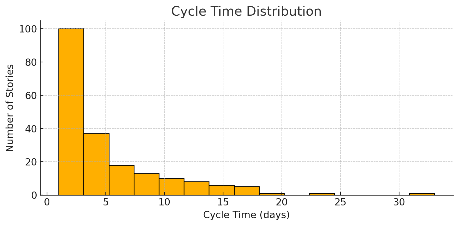
Why It Matters
Cycle time is the single best predictor of predictability. Short, consistent cycles allow you to forecast delivery dates with confidence and receive rapid user feedback. A fat tail, by contrast, conceals blocked work, unclear requirements, or skill bottlenecks that silently drain velocity and undermine stakeholder trust.
How to Use It in GitLab
- Generate the chart: In GitLab Duo, go to Analytics → Value Stream → Cycle Time to auto-render a distribution like the one above.
- Set a control limit: Note the 85th-percentile bar; anything beyond that gets an automatic red flag in GitLab’s Insights dashboard.
- Root-cause the outliers: Click a bar to drill into the specific MRs or issues. Tag the cause (dependency, scope creep, flaky tests) during the retro.
- Automate the alert: Turn on Duo’s “Cycle-Time Anomaly” rule so the next slow mover pings the team in Slack before the sprint derails.
- Track Δ over time: Re-export weekly and overlay the histograms—your goal is a visible left shift and a shrinking tail within two sprints.
Use the distribution as your flow pulse: if the bars inch right or the tail grows, you’re building up delivery cholesterol—time to clear the blockage before it becomes a heart attack.
Lead-Time vs Deploy-Time Scatter : What You’re Looking At
Each dot is a completed work item.
- X-axis (Lead Time) measures the days from idea created → code finished.
- Y-axis (Deploy Time) measures the days from code finished → code running in production.
A healthy plot shows most dots hugging the lower-left quadrant (short lead, short deploy). Dots high on the Y-axis reveal “code sitting on a shelf,” while dots far right expose lengthy build, review, or test phases before finish.
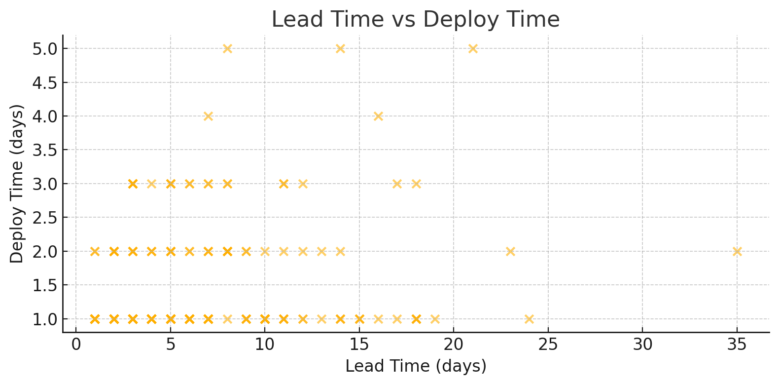
Why It Matters
Lead time captures how quickly you turn ideas into shippable software; deploy time exposes how fast or slow you get that value to customers. A cluster of points with low lead but high deploy means your dev team is fast but your release process is a bottleneck.
Flip it (high lead, low deploy) and requirements or coding capacity are the culprits. Mapping both dimensions together lets you pinpoint where to streamline for true end-to-end flow.
How to Use It in GitLab
- Generate the scatter: Navigate to Analytics → Insights and select the Lead vs Deploy template, or build a custom Insight using the lead_time and deploy_time metrics.
- Set alert thresholds: In GitLab Duo, configure rules like “deploy_time > 2 days” to auto-flag outliers in Slack or MS Teams.
- Drill into dots: Click any outlier to open the MR or issue, review pipeline logs, and tag root causes (environment wait, security scan delay, manual approval).
- Run an experiment: Automate one choke-point—e.g., enable continuous deployment for non-prod branches—and watch the Y-axis drop in the next week’s plot.
- Show progress: Export weekly images; overlay them or create a time-lapse GIF for sprint reviews so leadership sees dots migrating toward the coveted bottom-left corner.
Think of the scatter as airport radar (I love aviation LOL): dots clustered tight in the bottom-left corner signal smooth landings, while any dot that climbs high on the vertical axis (long deploy time) or drifts far to the right (long lead time) is a plane stuck in a holding pattern (burning fuel, delaying passengers, and begging for a clearance path before your next release window closes).
Weekly Average Flow Efficiency : What You’re Observing
The line chart plots one data point each week, with each point representing flow efficiency %—the ratio of “time actually being worked” to the total calendar time the item spent in the system. When the line trends upward (e.g., 70 % → 75 % → 85 %), your team is spending less time waiting in queues and more time adding value.
A dip or plateau indicates that work is stalling in hand-offs, reviews, or other idle states that don’t move the customer needle.
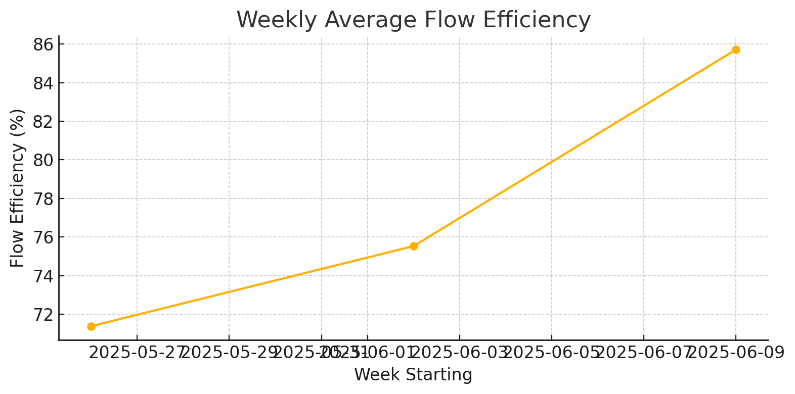
Why It Matters
Flow efficiency acts as an X-ray for hidden waste. A sprint can meet its velocity target while 60% of the calendar time is still consumed by waiting for approvals, environment set-ups, or context switches. Improving efficiency by even 10 points often reduces lead time by days and creates slack that can be reinvested in innovation, quality, or—yes—fewer late-night deploys.
How to Use It in GitLab
- Generate the trend: In GitLab Duo, open Analytics → Insights, choose the Value Stream Summary template, and select Flow Efficiency as the metric with a weekly granularity.
- Set guardrails: Draw a horizontal reference line at your target (for example, 55%). Any week below this line triggers a Slack alert.
- Drill down: Click on a low-efficiency week to reveal which stage, code review, QA, deploy, soaked up the wait time. GitLab will list the exact MRs or issues and their idle durations.
- Run small experiments: Shorten a manual approval, parallelize a test suite, or increase WIP visibility. Check the next week’s point: did the line tick upward?
- Broadcast wins: Export the chart every Friday and paste it into your sprint review. A rising line tells leadership you’re not just shipping; you’re streamlining.
Think of this chart as your process pulse: steady climbs mean a healthy, athletic workflow, while sudden drops signal bottlenecks starving your value stream of oxygen. Track it, tweak it, and watch both speed and morale climb together.
You can download the complete sample data as CSV file or embed these charts in your dashboards to demo how AI-augmented analytics will look in GitLab Duo as you rest out your process.
Wrapping Up
Metrics don’t just sit on PowerPoint slides; they come alive when integrated into daily decisions.
This week is your chance to turn cycle-time charts, lead-vs-deploy plots, and flow-efficiency trends into dynamic dashboards that uncover bottlenecks before they derail a sprint. Engage with each daily post, replicate the sample scripts, and insert the synthetic data (or your own) directly into GitLab’s Value Stream Analytics or whichever tool you prefer.
By next week, you’ll not only fluently speak the language of flow, but you’ll also have the graphs displayed on the wall, alerts in Slack, and a clear action list for reducing delivery times. Let’s move beyond merely admiring the data and start utilizing it.
Join us for our upcoming AI Workshops. We learn the first valuable skill in AI is prompting. Then we can learn how to turn these agents into our assistants and peers to help propel our teams to the next level!