Why This Matters.
A sprint planning session is too costly to spend half of it arguing whether a feature is “big” or “small.” By letting AI draft an initial Impact and Effort score, we can focus directly on strategic questions:
- Which outcome has the greatest impact on revenue or patient satisfaction?
- Which dependencies could derail momentum if overlooked?
Product, Engineering, and Go-to-Market teams can all view the grid, run “what-if” scenarios in seconds, and guide the discussion toward trade-offs and sequencing instead of complex spreadsheets (believe me, I have used these as well). This approach speeds up decisions, reduces cycle time, and provides stakeholders with a transparent, data-driven process rather than a black-box prioritization ritual.
The Pain.
Manual impact and effort scoring seem fair on paper but rarely hold up in real discussions with loud voices. A PO might spend three or four hours gathering analytics, consulting with Tech Leads, and filling out a matrix; only for the first stakeholder to say, “Those numbers feel off.”
The rest of the meeting then turns into re-scoring instead of making decisions. Meanwhile, developers wait for clarity, GTM deadlines slip, and the backlog grows. When you include global teams, this rehashing multiplies across time zones. The hidden cost isn’t just the hours spent; it’s the lost sense of urgency and the erosion of trust in the process.
The Bet.
We bet that if AI provides an objective-looking first estima, the team can spend the saved time scrutinizing assumptions and aligning on outcomes. The AI model analyzes historical bug counts, customer-impact tags, and story size patterns to assign a 1-10 Impact and Effort score.
Are the numbers perfect? Never. But they’re “good enough to argue about,” which is exactly the point. Instead of defending manual calculations, the PO begins the meeting by saying, “Here’s the AI baseline, let’s adjust based on what we know.” The result should be a prioritized grid everyone contributed to and is willing to defend, generated in minutes, with no one feeling overwhelmed by spreadsheet work.
Step-By-Step
- Paste backlog IDs + summaries into Column A of a new Google Sheet.
- In Extensions ▸ Apps Script, replace the boilerplate with the code below.
- Insert your OpenAI key, save, then run init() once (authorize when prompted).
- Return to the sheet. Impact and Effort columns auto-populate in seconds.
- The script draws a chart object named "ImpactEffortGrid”, and adjust labels as you like.
This is akin to our Relative Weighting prioritization exercise with stakeholders. I would still probably do those as planned, this is more about discussing the numbers more than getting the numbers. AI did the heavy lifting based on other data points it can see much quicker than we can. We will use Google Apps Scripts for this example.
Input Sample
| Backlog Item (Impact / Effort) | Why Impact Score | Why Effort Score |
|---|---|---|
| Push notifications for upcoming appointments 8 / 3 | Missed visits hurt patient experience and provider utilization; timely reminders lift both metrics, so impact scores high. | Mobile push uses existing FCM/APNs plumbing; modest API work keeps effort low-to-medium. |
| Improve video stability on low bandwidth 9 / 7 | Frozen consults destroy trust; smoother calls drive retention and NPS, nearly maxing impact. | Codec tuning, edge-case handling, possible infra upgrades push effort into the upper range. |
| Make upload button 44 px on mobile 6 / 2 | Usability fix that reduces friction but doesn’t unlock new revenue; mid-impact. | Single UI tweak plus analytics, minimal backend work makes effort very low. |
| Enable secure provider–patient messaging 10 / 8 | Direct chat unlocks new use cases and retention; maximum customer and revenue lift. | End-to-end encryption, audit logging, multi-platform clients, big lift equals high effort. |
| Persist session for 15 min when reading notes 5 / 1 | Quality-of-life improvement for a subset of users; moderate impact. | Minor session-timeout parameter change and regression test, effort near zero. |
Google Apps Script
/** impactEffort.gs
 *  Auto-score backlog items and draw an Impact × Effort grid
 *  Requirements:
 *    • A Google Sheet with backlog summaries in column A
 *    • Your OpenAI key pasted below
 *  Steps:
 *    1. Replace the boilerplate script with this file.
 *    2. Add your key, hit ▶ init(), grant permissions.
 *    3. Impact (B) and Effort (C) populate; grid appears.
 */
const OPENAI_KEY = 'YOUR_OPENAI_KEY';       // ← insert key
// ───── Entry point ────────────────────────────────────────────
function init() {
  const sh = SpreadsheetApp.getActiveSheet();
  if (!sh.getRange('B1').getValue()) {
    sh.getRange('B1').setValue('Impact');
    sh.getRange('C1').setValue('Effort');
  }
  scoreRows();
  drawGrid();
}
// ───── Score each backlog row via OpenAI ──────────────────────
function scoreRows() {
  const sh   = SpreadsheetApp.getActiveSheet();
  const rows = sh.getDataRange().getDisplayValues();

  for (let r = 1; r < rows.length; r++) {
    const summary = rows[r][0];
    if (!summary) continue;                         // skip blanks
    const prompt = `
Rate impact (1–10) and effort (1–10) for this backlog item.
Respond ONLY JSON: {"impact":#,"effort":#}
Item: ${summary}`;
    const scores = callOpenAI(prompt);
    if (scores) {
      sh.getRange(r + 1, 2).setValue(scores.impact);
      sh.getRange(r + 1, 3).setValue(scores.effort);
    }
  }
}
// ───── Call OpenAI ChatCompletion API ─────────────────────────
function callOpenAI(prompt) {
  const payload = {
    model: 'gpt-4o',
    messages: [{ role: 'user', content: prompt }],
    temperature: 0.2
  };
  const opts = {
    method: 'post',
    contentType: 'application/json',
    headers: { Authorization: 'Bearer ' + OPENAI_KEY },
    payload: JSON.stringify(payload)
  };
  const res   = UrlFetchApp.fetch('https://api.openai.com/v1/chat/completions', opts);
  const body  = JSON.parse(res.getContentText());
  return JSON.parse(body.choices[0].message.content);
}
// ───── Draw the Impact × Effort scatter chart ─────────────────
function drawGrid() {
  const sh = SpreadsheetApp.getActiveSheet();
  const chart = sh
    .newChart()
    .asScatterChart()
    .addRange(sh.getRange('B2:C' + sh.getLastRow()))
    .setOption('hAxis', { title: 'Effort (1 = low)' })
    .setOption('vAxis', { title: 'Impact (10 = high)' })
    .setOption('title', 'Impact vs Effort Grid')
    .setPosition(1, 5, 0, 0)
    .build();

  sh.insertChart(chart);
}
Prompt Template
You are a Product Analyst.
Given this backlog item summary, rate:
impact: customer or revenue lift (1-10)
effort: relative story size (1-10)
Return JSON {impact:INT, effort:INT}.
Summary: "{backlog_summary}"
Example Data Grid
| ID | Summary | Impact | Effort |
|---|---|---|---|
| MC-12 | Add push notifications for upcoming appointments | 8 | 3 |
| MC-07 | Improve video stability on low bandwidth | 9 | 7 |
| MC-22 | Make upload button 44 px on mobile lab-upload screen | 6 | 2 |
| MC-35 | Enable secure provider–patient messaging | 10 | 8 |
| MC-04 | Persist session for 15 min when reading notes | 5 | 1 |
Dots in the top-left “Quick Win” quadrant are low effort, high impact; start there.
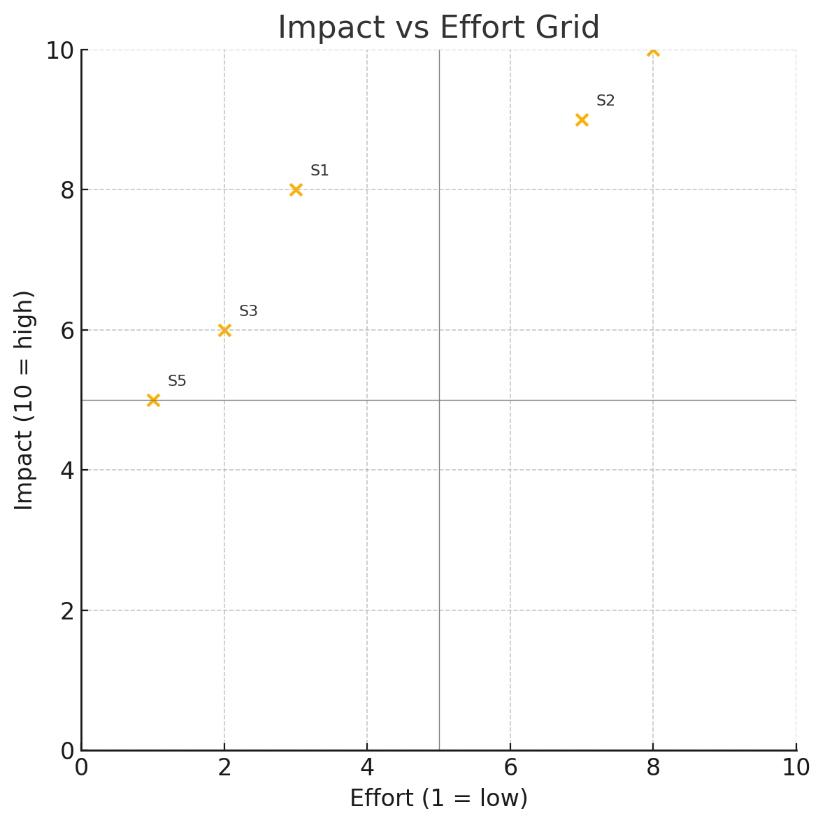
Talk about the grid, not the numbers
The numbers in the grid are just an initial indicator; they will change the moment someone says, “But effort is really a 5 once we factor in that library upgrade.” What matters is where each dot is positioned relative to the others, does it cluster with quick wins, fall into heavy-lift territory, or sit in the no-man’s-land of low impact and high effort?
That placement sparks the real conversation: engineers examining technical risks, marketers evaluating revenue potential, and compliance teams identifying hidden constraints. The AI simplified the math, not the discussion. Use the positions to encourage debate, challenge assumptions, and reach a shared agreement on what to prioritize next. Numbers shift; alignment remains.