
-- Combine Jira cycle-time data with AI tags, reveal queues, and use swarm where it matters.
Why This Matters.
Shipping faster isn’t just about smaller stories; it’s about reducing wait times at every hand-off. AI already drafts and prioritizes your stories, but if half of their lifecycle is spent sitting in “In Review,” you’re wasting the time you just saved. A flow-efficiency lens combines Jira cycle-time metrics with the AI tags we’ve added (theme, risk, effort). One stacked bar shows exactly where work is idling and which themes are most affected, helping the team target the worst queues instead of guessing where to improve.
The Pain.
Teams often track lead time (idea to done) and cycle time (start to done), but they rarely break cycle time into active vs. queue time. A story might have a four-day cycle time but only six hours of actual coding. Without this visibility:
- Developers blame scope, product owners blame dev capacity, and nobody sees the review bottleneck.
- Every retrospective ends with “be faster,” but there’s no clear goal.
- AI-assisted story drafting seems like a mirage—stories are “ready” faster, but nothing ships sooner.
The Bet.
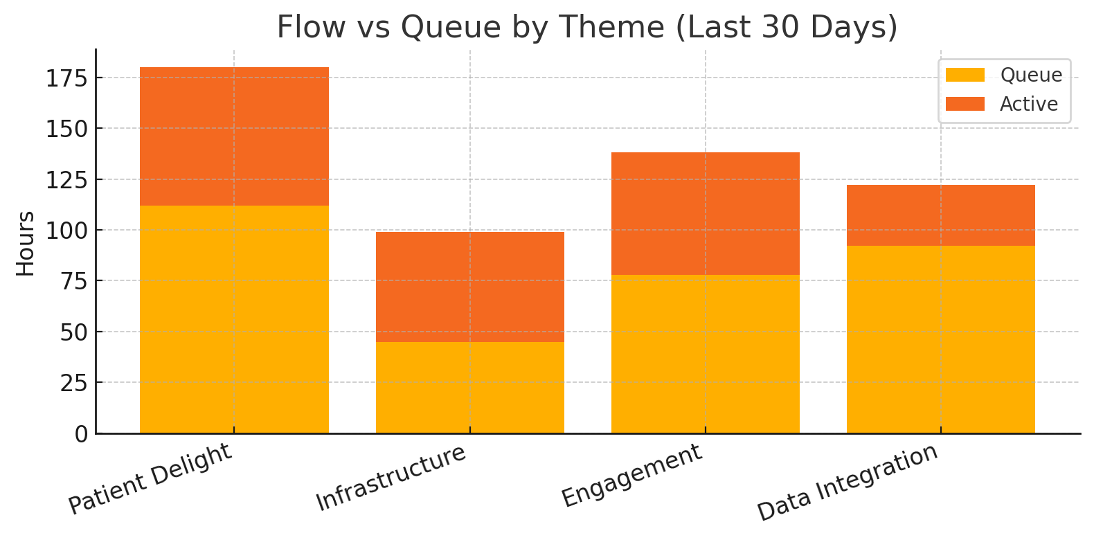
If we chart flow efficiency per theme, such as Patient Delight or Infrastructure, we’ll see orange queue bars exceeding green active bars. Developers can then swarm the largest orange section, tighten WIP limits, or automate deployment gates. We expect a 10–20% increase in efficiency within two sprints once the biggest queue is identified and addressed.
Inputs You Will Need.
- Jira API token with access to "/rest/api/3/search and /cycle/analytics".
- Backlog CSV that already includes AI tags (Theme, Risk, Effort).
- Python script flow_efficiency.py (below), pandas, and matplotlib.
Step By Step.
| Step | Action | Output |
|---|---|---|
| 1 – Export AI tags | Save your backlog with Theme/Risk/Effort columns to ai_tags.csv. | CSV mapping IDs to themes. |
| 2 – Run script | python flow_efficiency.py --since 30d pulls Jira cycle-time and joins tags. | DataFrame of queue vs active hours. |
| 3 – Compute flow % | Script calculates active / (active + queue) per theme. | Table with flow-efficiency metric. |
| 4 – Plot chart | Matplotlib stacked bar saved as flow_lens.png. | Orange (queue) + green (active) bars by theme. |
| 5 – Retro swarm | Bring chart to retrospective; pick biggest orange bar to attack. | Concrete plan to cut idle time. |
The Script.
#!/usr/bin/env python3
"""
Pull Jira cycle-time data, join with AI tags, and plot flow efficiency.
"""
import os, sys, argparse, requests, pandas as pd, matplotlib.pyplot as plt
JIRA_BASE   = os.getenv("JIRA_BASE")      # e.g. https://big-agile.atlassian.net
JIRA_TOKEN  = os.getenv("JIRA_TOKEN")
HEADERS     = {"Authorization": f"Bearer {JIRA_TOKEN}",
               "Accept": "application/json"}
def fetch_cycle(issue):
    url = f"{JIRA_BASE}/rest/cycle/analytics/1.0/issue/{issue}"
    return requests.get(url, headers=HEADERS, timeout=10).json()
def main(days):
    tags = pd.read_csv("ai_tags.csv")               # ID, Theme, Risk, Effort
    jql  = f"updated >= -{days}d AND statusCategory = Done"
    search = f"{JIRA_BASE}/rest/api/3/search?jql={jql}&fields=key"
    issues = [i["key"] for i in requests.get(search, headers=HEADERS).json()["issues"]]
    rows = []
    for key in issues:
        data = fetch_cycle(key)
        queue = sum(p["time"] for p in data if p["type"] == "queue")
        active = sum(p["time"] for p in data if p["type"] == "active")
        rows.append({"ID": key, "queue": queue, "active": active})
    df = pd.DataFrame(rows).merge(tags, on="ID")
    agg = df.groupby("Theme").sum()
    agg["flow_pct"] = agg["active"] / (agg["active"] + agg["queue"])
    # Plot
    fig, ax = plt.subplots(figsize=(8,4))
    ax.bar(agg.index, agg["queue"], label="Queue", color="#f0c330")
    ax.bar(agg.index, agg["active"], bottom=agg["queue"], label="Active", color="#56dfa6")
    ax.set_ylabel("Hours"); ax.set_title("Flow vs Queue by Theme (last %sd)" % days)
    ax.legend(); plt.xticks(rotation=30, ha="right"); plt.tight_layout()
    plt.savefig("flow_lens.png", dpi=150)
    print("✅ flow_lens.png ready; flow efficiency table:\n", agg[["flow_pct"]])
if __name__ == "__main__":
    ap = argparse.ArgumentParser()
    ap.add_argument("--since", default="30d", help="Jira JQL relative date, e.g., 14d, 30d")
    main(ap.parse_args().since.rstrip("d"))
The Output.
| Theme | Queue h | Active h | Flow % |
|---|---|---|---|
| Patient Delight | 112 | 68 | 0.38 |
| Infrastructure | 45 | 54 | 0.54 |
| Engagement | 78 | 60 | 0.43 |
| Data Integration | 92 | 30 | 0.25 |
A flow efficiency of 0.38 means 62 % of total time is waiting, ripe for a swarm.
What Good Looks Like.
- The chart turns orange bars into swarm targets, devs know where to burn idle calories.
- Flow % increases by 10–20 points within two sprints; cycle time decreases simultaneously.
- Joy Index rises because fewer reviews and deployment waits lead to fewer context switches.
The numbers are a mirror, not a mandate. Bring the chart to retro, ask “Why does Patient Delight idle twice as long?” then swarm, split, or automate until orange shrinks. AI tagged the work; your team turns data into speed.