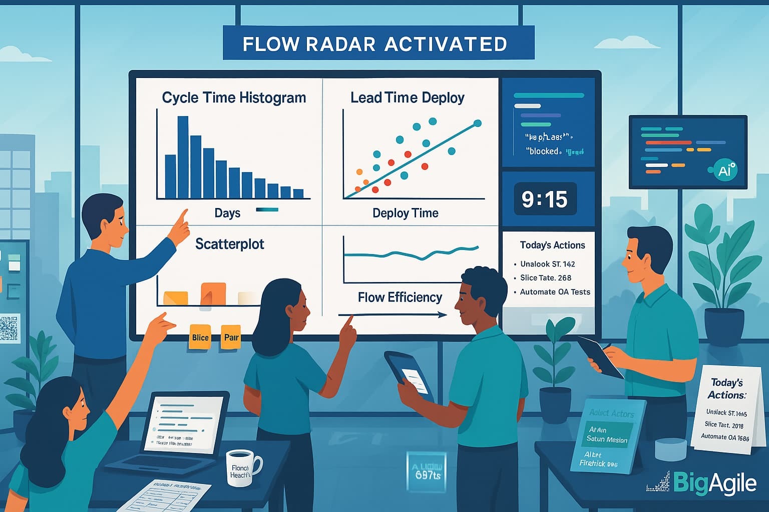
Next up for our series this week: Flow Radars. Velocity charts tell you what happened (lagging indicators); AI-driven flow analytics tells you what’s about to break. Below is a hands-on recipe (borrowed from another team, so obviously adjustments must be made for your team/situation) for wiring your backlog and CI/CD events into an LLM, then auto-flagging the top three bottlenecks every day, as promised, no PhD, data lake, or six-figure tooling required (maybe by the time YOU get done with it will LOL).
Architecture at a Glance
All event data, Jira issues, CI/CD jobs, and merge-request updates—first flows into a lightweight ETL script that runs on a cron job or GitLab CI.
This script normalizes the payloads to parquet/CSV format, allowing a simple pandas engine to compute WIP age, cycle time, lead time, and blocked status in seconds. The metrics summary is then sent to an LLM (OpenAI, Azure OpenAI, or a self-hosted model) that ranks the worst offenders and generates one-line remediation tips.
Last, the LLM’s JSON response is transmitted through a webhook to Slack, Microsoft Teams, or email, enabling the team to see actionable bottlenecks before the daily stand-up. Each layer is interchangeable; swap Jira for Azure Boards or plug the same JSON into Power BI, making the architecture tool-agnostic and quick to pilot in a single afternoon.
Jira / Azure Boards / GitLab Issues  ─┐
                                     ├─▶ ① ETL Script (Python, cron) ──▶ parquet / CSV
GitLab / GitHub Pipeline Events  ────┘
      parquet / CSV  ──▶ ② Flow-Metrics Engine (pandas)
                               │
                               ▼
                    JSON summary of WIP Age, Cycle Time, Blockers
                               │
                               ▼
            ③ LLM (OpenAI / Azure OpenAI / local GPT-J)
                               │
            “Return top-3 bottlenecks and an action plan”
                               ▼
    ④ Alert Channel (Slack / MS Teams / e-mail webhook)
Pull Your Raw Events
The first step is to grab fresh signals from the tools you already use. A pair of simple API calls—one to your backlog system (Jira, Azure Boards, GitLab Issues) and one to your CI/CD platform—extracts every in-flight story and pipeline run in real time.
By immediately flattening those JSON payloads into tidy CSV or parquet tables, you sidestep the complexity of data lakes and give pandas a clean slate for fast metric calculations. Consider converting scattered ”tool chatter” into a single, structured conversation that your analytics and LLM can understand.
curl -u "api-user:${JIRA_TOKEN}" "https://yourcompany.atlassian.net/rest/api/3/search?jql=project=ABC AND status not in (Done)" > backlog.json
curl -H "PRIVATE-TOKEN:${GITLAB_TOKEN}" "https://gitlab.com/api/v4/projects/123/jobs?scope=success,failed,canceled" > pipelines.json
Then convert to CSV or parquet for fast iteration
import pandas as pd
import json
stories = pd.json_normalize(json.load(open("backlog.json"))['issues'])
jobs = pd.json_normalize(json.load(open("pipelines.json")))
stories.to_parquet("stories.parquet")
jobs.to_parquet("jobs.parquet")
Compute Flow Metrics
With your data normalized, a few pandas commands can transform raw timestamps into metrics that reveal real drag: cycle time (start → finish), lead time (creation → finish), deploy time (finish → prod), WIP age, and a quick Boolean for blocked items.
These calculations take milliseconds yet uncover days of hidden waste. Adding a composite “drag score” that weights long lead time, long cycle time, and blocked status lets you instantly rank every work item by the pain it’s causing. No BI suite, no data warehouse, just a lean script that converts timestamp chaos into a prioritized hit list your team can tackle before the next stand-up.
df = pd.read_parquet("stories.parquet")
df['wip_age']     = (pd.Timestamp.utcnow() - pd.to_datetime(df['fields.statuscategorychangedate'])).dt.days
df['cycle_time']  = (pd.to_datetime(df['fields.resolutiondate'])
                     - pd.to_datetime(df['fields.created'])).dt.days
df['blocked']     = df['fields.labels'].str.contains('blocked', na=False)
candidate = df.loc[df['status']!='Done', ['key','summary','wip_age','cycle_time','blocked']]
candidate['drag_score'] = (
      candidate['wip_age']/candidate['wip_age'].quantile(0.85) +
      candidate['cycle_time']/candidate['cycle_time'].quantile(0.85) +
      candidate['blocked'].astype(int)*2
)
top3 = candidate.nlargest(3, 'drag_score')
payload = top3.to_dict(orient='records')
Ask the LLM for Insight & Action
Raw metrics indicate what is slow; a language model explains why and what to do about it. By feeding the top-ranked work items, complete with cycle time, WIP age, and blocked flags, into an LLM prompt, you transform sterile data into plain-language diagnostics
(“Stalled waiting for UX review”) along with one-line remediation tips (“Pair with designer or slice acceptance criteria”).
The model returns a compact JSON array that your bots can read, attach to the ticket, and push straight into Slack. The result is that actionable guidance surfaces automatically, saving the team from debating dashboards and allowing them to focus on unblocking the real work.
from openai import OpenAI
client = OpenAI(api_key="YOUR_KEY")
prompt = f"""
You are a Flow-Analytics assistant.
Here is JSON about our in-flight work:
{payload}
For each item, output:
- bottleneck_reason (1 sentence)
- recommended_next_step (1 sentence)
Return JSON array.
"""
response = client.chat.completions.create(
    model="gpt-4o-mini",
    messages=[{"role":"user", "content": prompt}],
    temperature=0.2
)
actions = response.choices[0].message.content
Push to Slack
The last mile is delivery: pipe the LLM’s JSON summary into a Slack (or Teams) webhook so every developer walks into stand-up already knowing the three most significant flow risks.
The message includes the ticket link, the AI-generated bottleneck reason, and the recommended next step—all inline, no extra clicks. Because the script runs on a schedule (or after each pipeline event), alerts appear while there’s still time to act, not hours after the sprint derails.
Turning insights into chat-sized nudges keeps the signal where your team lives every day and turns flow improvement from a monthly report into a daily habit.
import requests, os, json
slack_msg = {
  "text": "*Daily Flow Radar*",
  "blocks": [
     {"type":"section",
      "text":{"type":"mrkdwn","text":"```" + actions + "```"}}
  ]
}
requests.post(os.environ['SLACK_WEBHOOK'], json=slack_msg)
Reading the Output
Use the table like a triage board at every stand-up. If a card’s WIP age spikes above the 85th percentile, pull it to the top of the discussion and decide whether to slice or swarm. Any item flagged as blocked = true gets an immediate owner—usually the PO or Scrum-of-Scrums rep to chase the external dependency before the next 24-hour cycle.
Cycle-time outliers belong in the sprint retrospective: unpack why they lingered, tighten the Definition of Ready or QA hand-offs, and add a guardrail (e.g., auto-flag when a story exceeds its historical 75th-percentile time). Review the metrics again on Friday; you should see fewer red flags and a shorter right-hand tail in your charts.
Iterate weekly, and these simple signals will shave days off lead time without adding more tools or meetings.
| Field | What It Means | Typical Fix |
|---|---|---|
| wip_age > 85th pct | Card marinating too long in progress or review queues. | Re-slice, pair-program, or spike risk; escalate in stand-up. |
| blocked = true | External dependency or unanswered question is freezing flow. | Escalate in Scrum of Scrums, involve PO to remove blocker. |
| cycle_time outlier | Work item took dramatically longer than peers to finish. | Tighten Definition of Ready, strengthen QA pairing or tests. |
Top-10 WIP-Age Bar Chart:
A horizontal bar chart ranks the ten in-flight work items with the highest work-in-progress age. Red bars identify items tagged “blocked”; blue bars represent simply old items.
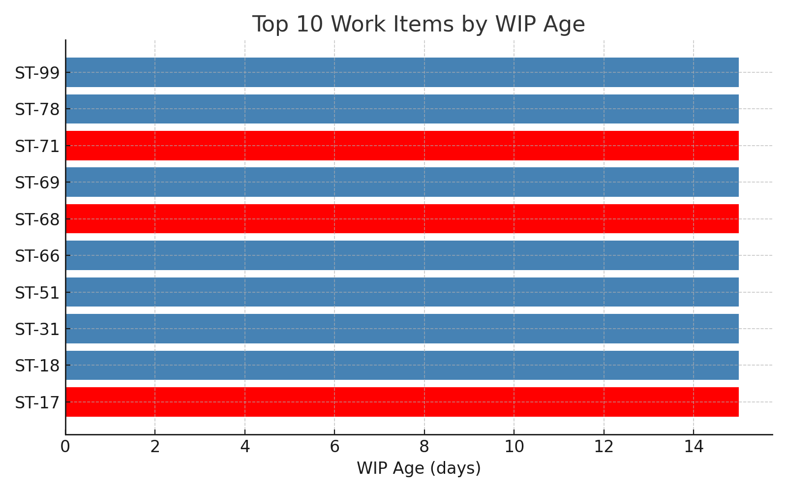
Why It Matters
WIP age serves as an early warning signal for hidden drag. Anything that remains half-done absorbs cognitive load, occupies branch capacity, and diminishes predictability. A single blocked card can create ripples throughout a sprint and disrupt a release train.
How to use it in real life.
Review the chart in the stand-up:
- Address the longest red bar first; escalate the dependency or reduce the scope.
- If blue bars dominate, tighten WIP limits or use pair programming to complete work more quickly.
- Re-run the chart daily; aim to keep each bar below a pre-agreed “age limit” (e.g., 5 days).
Cycle-Time Boxplot with Outliers
The box displays the middle 50% of cycle-time values; whiskers extend to near extremes; orange dots represent statistical outliers—stories that took significantly longer than the others.
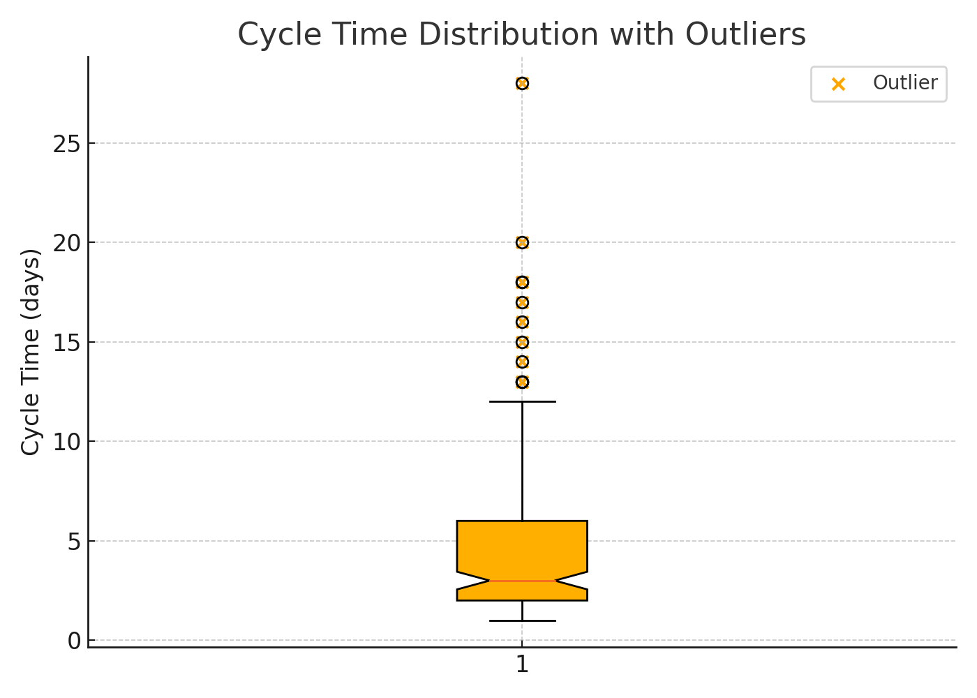
Why It matters
Most teams improve their average cycle time but ignore tail risk. Outliers inflate lead-time forecasts, conceal brittle test suites, and create unexpected scope debt. One mega card can consume the same capacity as five small ones.
How to use it in real life:
- Click on each outlier in your tool and tag the root cause (unclear requirements, flaky tests, long review queues).
- Log the causes on a shared “Cycle-Time Outlier" board, and tackle the most frequent ones first.
- After two sprints, the dots should migrate into the box—or your process hasn’t truly changed.
Lead-Time vs. Deploy-Time Scatter
Each dot represents a completed item. The X-axis indicates the time from idea to finished code, while the Y-axis reflects the time from finished code to production deploy. Red dots signify items that were blocked at some stage.
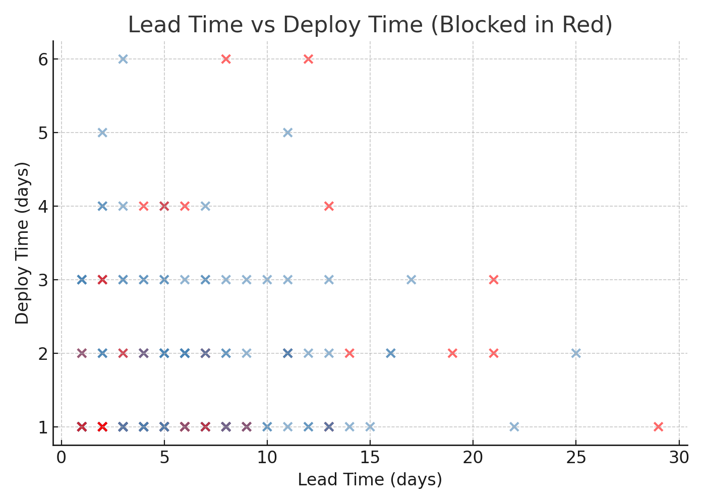
Why It Matters
Plotting both axes reveals where your process is slow. Dots further to the right imply slow coding or requirement churn, while dots higher up signal release bottlenecks. Clusters of red dots highlight systemic blockers—environment waits, security reviews, manual approvals.
How to Use It in Real Life
- Draw vertical and horizontal target lines (e.g., ≤ 7-day lead, ≤ 1-day deploy).
- Investigate any dot that goes beyond a line; automate or decouple that chokepoint.
- Run the scatter weekly; a successful intervention shows dots moving toward the lower-left quadrant.
Wrapping Up
Flow metrics only pay dividends when they drive the next conversation, not the next vanity chart. Start small this week, wire up the alerts, tackle one WIP-age offender, and slice the worst cycle-time outlier.
By the time those wins register on your scatterplots, you’ll be ready for the next layer: tying flow data to customer outcomes, not just delivery speed. In our upcoming post we’ll show how to blend these metrics with user-impact signals so you can prove that every hour you save in the pipeline shows up as real value in the product.
Stay tuned, experiment boldly, and let the numbers point the way.
Updated with All 4 Flow Radar Posts
Download the sample scripts, wire them into your backlog today (make them better BTW), and post your first cycle-time chart in Slack before tomorrow’s stand-up.
Then grab a seat in our AI for Scrum Master or AI for Product Owner micro-courses to turn those insights into automated coaching workflows.
Spots fill fast, hit the link, reserve your cohort, and show up with real data.