Product management has taken many forms since Procter & Gamble introduced the term in the early 1930s. Yet, the core purpose remains the same: one accountable steward guides a product from its initial idea to market reality (and usage). I would think no single person can handle every task, but a skilled leader can coordinate cross-functional talent, synthesize diverse perspectives, and still make the final call on what gets built and when.
Software / Product Teams, however, often fall short, shipping plenty but still wondering if they solved the right problem. Our goal is simple: build the right system, build it the right way, deliver it at the right time, and keep stakeholders satisfied along the way. That begins with understanding what “right” means, and the clearest clues come from how people use the product.
Usage analytics should drive every backlog discussion, but collecting and analyzing those signals can seem overwhelming. With new tools emerging and proven techniques maturing, I spent this weekend reflecting on five usage-based signals that consistently help teams cut through the noise. Your situation may differ, but these patterns are widely applicable, so I hope they help catalyze your methods.
Data Driven.
Yeah, yeah, we hear it all the time: be data-driven (not opinion-driven). When your leaders or teams say “let’s be data-driven,” what does that mean? For product managers, I think it means incorporating real user behavior into each refinement of the Product Backlog. This week, we will focus on five key signals you can extract from emerging analytics tools like Mixpanel and Amplitude, then follow them to Sprint Planning.
Adoption depth: Who even sees the feature?
- What it is: Count of unique users who trigger a Feature Viewed (or similar) event. It tells you how broadly the capability is exposed.
- How to capture: In Mixpanel, open an Insights report, filter on the Feature Viewed event, and select Uniques as the aggregation.
- How to use it: A low adoption ratio (say, <40% of DAU) usually means discoverability is the problem, not functionality.
- Prioritization cue: Stories that increase adoption often unlock downstream metrics like frequency and retention; give them a high cost-of-delay score even if effort is moderate.
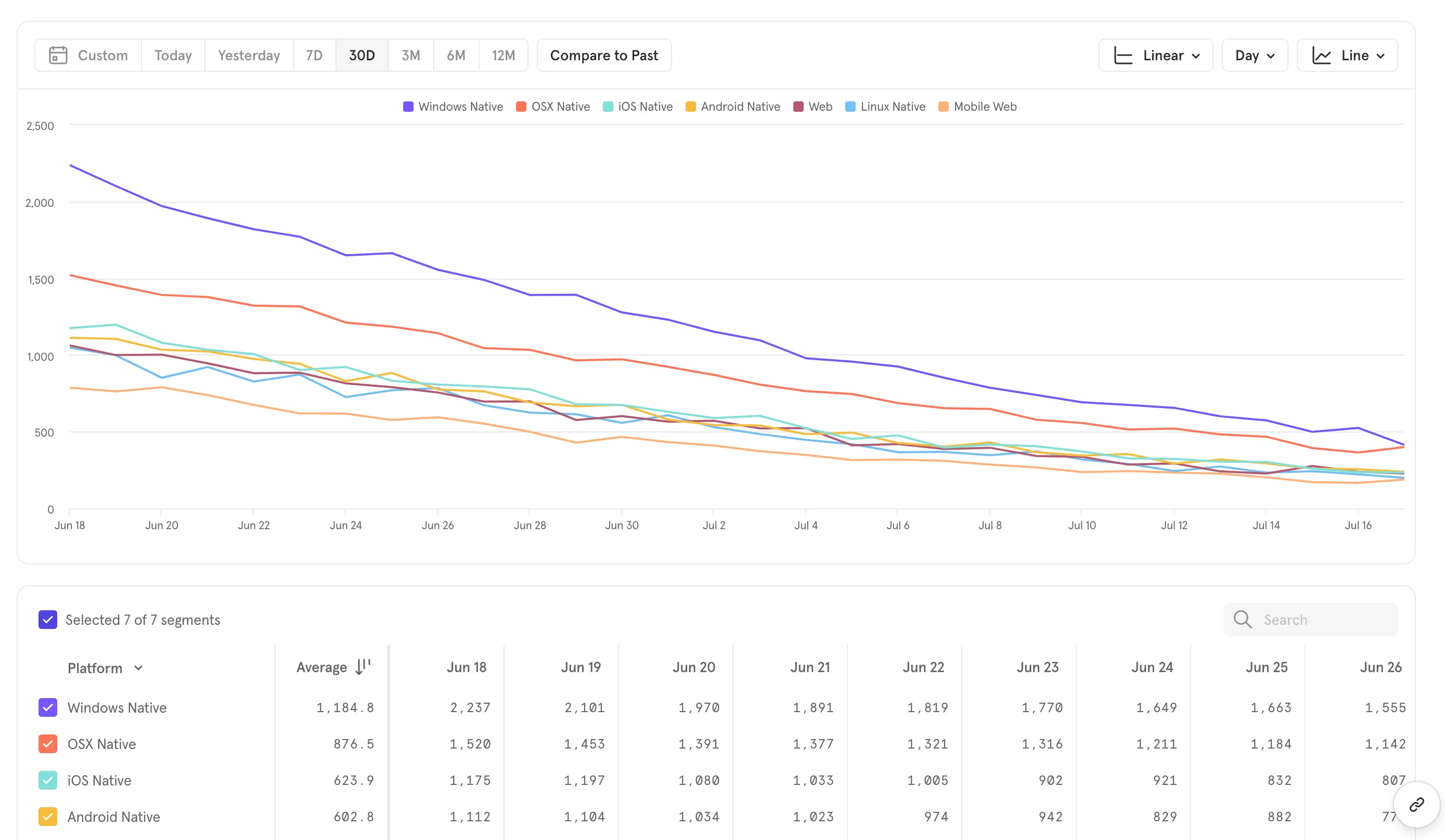
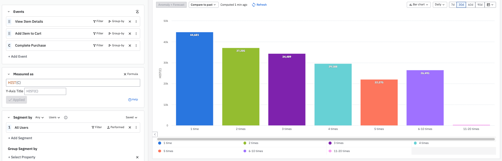
Frequency: Is it becoming a habit?
- What it is: Average number of times each adopter uses the feature in a time window.
- How to capture: Same Insights report, but aggregate on Total events, then divide by unique users for a quick mean; or plot a histogram of per-user counts.
- How to use it: The frequency increases when the feature aligns with a repeatable workflow. If adoption is high but frequency is low, you likely need deeper workflow integration.
- Prioritization cue: Improvements here boost engagement that drives revenue or retention; pair “frequency boosters” with small stories such as keyboard shortcuts or saved presets.
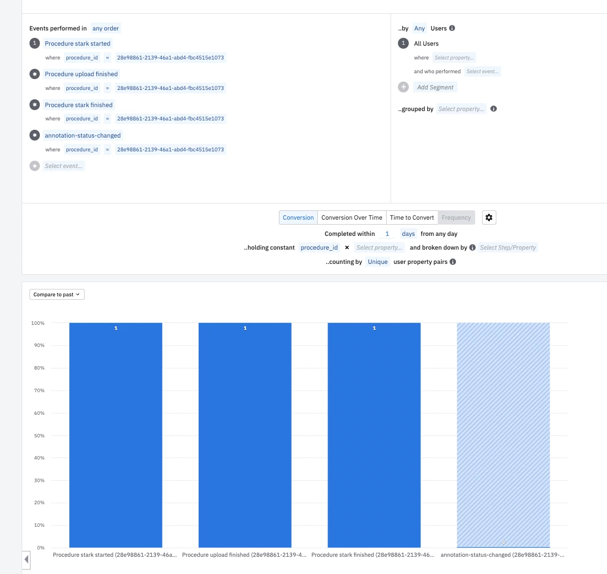
Task success: Does the flow finish?
- What it is: Ratio of successful completions to attempts. Example: Task Completed with property task_name = filter-apply.
- How to capture: In Amplitude, create an Event Segmentation chart that divides Task Completed events by Task Started.
- How to use it: A 68 % success rate flags friction, validation errors, unclear copy, or missing states. Qualitative research can explain the “why”, but the metric shows “where”.
- Prioritization cue: Each percentage-point lift in task success often equates to direct value (orders placed, data exported). Estimate impact by multiplying expected lift by business value, then score high on your scoring templates.
Time-in-feature: How long does it take to get value?
- What it is: Median or 95th percentile session duration while the feature is active.
- How to capture: To capture data effectively, use Session Metrics in Mixpanel or measure the time between feature_open and feature_close events. Additionally, community posts provide guidance on computing averages between steps in Amplitude.
- How to use it: Long right-tail times usually point to advanced users fighting complexity. Shorten the tail with presets, wizards, or AI suggestions.
- Prioritization cue: Reducing p95 time cuts support costs; assign a higher impact score when the tail affects high-value cohorts.
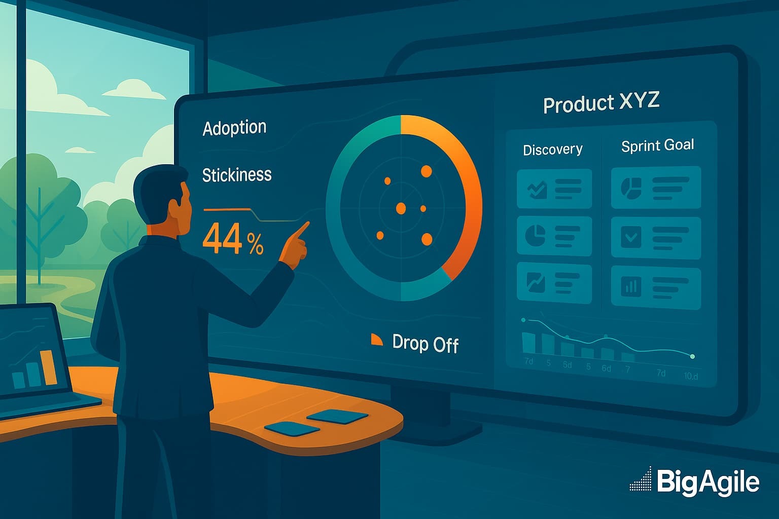
Stickiness: Do users come back?
- What it is: Percentage of users who trigger the event on n distinct days within a week (or month).
- How to capture: In Amplitude, open the Stickiness chart, choose a 7-day window, and note the user share in the 1-, 3-, or 7-day buckets.
- How to use it: Stickiness is an early retention predictor; failing features plateau at ≤25 %.
- Prioritization cue: Stories that promise a stickiness jump deserve substantial cost-of-delay weighting, especially for subscription products.
From Metrics > Backlog > Sprint.
Data alone does not transform a roadmap. The magic happens when small, cross-functional teams translate raw signals into concrete backlog items, run disciplined experiments, and fold the learning back into their plan. Treat each hand-off; from metric to insight, insight to story, story to Sprint, as a lightweight loop inside your existing Scrum cadence. Done well, this translation step keeps discovery and delivery in constant conversation.
The Steps:
- Spot the signal: Pull the five metrics into a shared dashboard and review them during Backlog Refinement.
- Form a hypothesis: “If we add a ‘Download CSV’ button, funnel drop-off at Export will fall below 20%.”
- Slice vertically: Write the slimmest story that can test the hypothesis in one Sprint.
Let's Do This!
Score with evidence-weighted techniques: Reach x Impact x Confidence (grounded in the metric) ÷ effort. This adapts the classic RICE or RVCE formula without heavy spreadsheets.
Inspect and adapt: Release behind a feature flag, re-measure the same metric, decide to iterate or move on. Another great technique is Relative Weighting or even Kano Analysis.
Using usage data isn’t a perfect fix, but it gets us closer to the truth about product-market fit than opinions or vanity metrics ever could. By focusing your backlog on these five signals; adoption depth, frequency, task success, time-in-feature, and stickiness, you empower your Scrum team to discuss what truly matters, break down stories to test clear hypotheses, and confidently iterate.
This week, we will explore how to use these five signals, enabling your Scrum team to replace opinion-based prioritization (the dangerous animals of product management) with data-driven conversations that align smoothly with the natural cadence of Sprint Review and Sprint Planning.
By Friday, we aim for you to have closed at least one metric loop and for your backlog to tell a clearer story of what to build next and why.