Your deployment frequency dropped last Tuesday. Your lead time is up this sprint. A stakeholder is already asking for an explanation. Here is the most important question nobody is asking: did anything actually change?
This is the central problem with how most product and engineering teams manage metrics. They treat every movement as meaningful. Every dip triggers a postmortem. Every spike triggers celebration. And the team spends an enormous amount of time and energy writing what statistician Donald Wheeler calls "fiction," which is to say, explanations for variation that has no single identifiable cause.
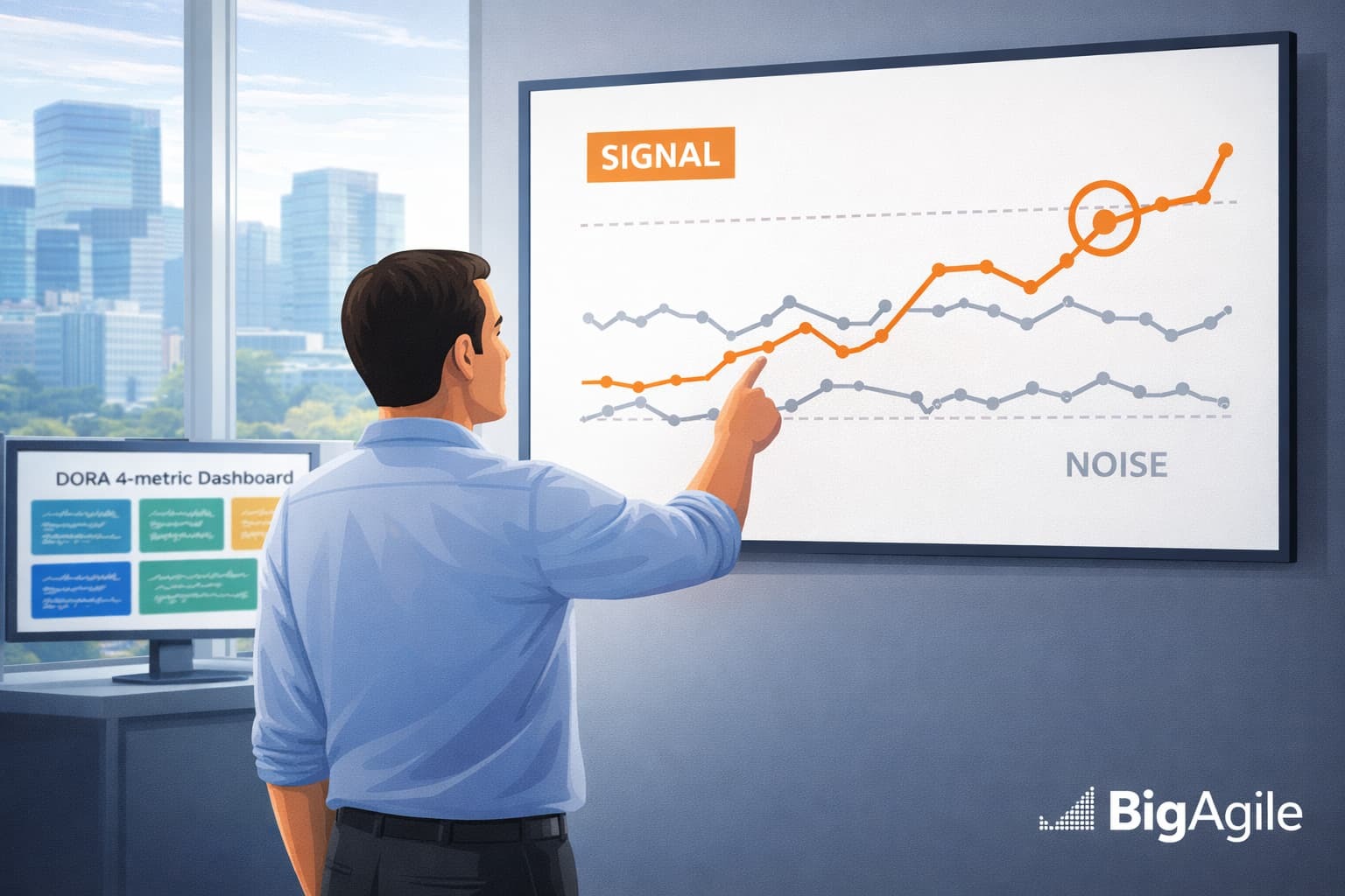
Learning to tell the difference between a signal and noise is not a statistical nicety. It is a practical leadership skill. Get it right and your reviews become faster, your decisions sharper, and your team stops wasting half the sprint on explanations that lead nowhere.
What Signal and Noise Actually Mean
Every metric you track is produced by a system. That system has natural variation built into it. Teams change, environments shift, work complexity varies sprint to sprint. In a stable system, that variation will stay within predictable upper and lower limits, even when the numbers bounce around week to week.
Noise is movement within those limits. It is the natural heartbeat of a healthy, complex system. It does not have a root cause you can find and fix. It is simply the cost of doing real work in a real environment.
A signal is something different. A signal is a data point that falls outside the system's normal range, or a pattern (like a sustained run of points on one side of the average) that suggests something genuinely changed. When you see a signal, investigation is warranted. When you see noise, investigation is waste.
Mark Graban addresses this directly in Measures of Success, where he describes teams that spend enormous amounts of time explaining the unexplainable, generating plausible-sounding stories to satisfy whoever asked "what happened?" The answer, most of the time, is: nothing happened. The system varied. That is what systems do.
Mark Graban, Measures of Success: https://markgraban.com/measuresofsuccessbook/
Why Trends, Variance, and Seasonality Trip Teams Up
Three patterns in particular cause leaders to misread their data and reach for explanations that do not exist.
Trends without context. A metric that has been improving for three weeks looks like momentum. A metric that drops for two weeks looks like a crisis. But short-run trends in complex systems are almost always noise. You need enough data points to distinguish a genuine directional change from random clustering. As a general rule, fewer than eight data points is rarely enough to call a trend meaningful.
Variance confusion. Two teams can have the same average deployment frequency but wildly different levels of consistency. One deploys reliably every two days. The other deploys in clusters, sometimes five times in a week and then nothing for ten days. The averages look the same. The systems are completely different, and the risks are completely different. Always look at the spread, not just the center.
Seasonality as signal. Product teams regularly panic about metrics in the first two weeks of January, during major holidays, and around fiscal year transitions. These are not signals. They are predictable patterns driven by external conditions your team does not control. If you have not annotated your charts to account for known seasonal effects, you will spend a lot of time explaining the holidays.
Anchoring to Metrics That Actually Predict Performance
Before you can meaningfully track signal versus noise, you need to be measuring the right things. The DORA 2024 research remains the most credible framework for software delivery measurement, and it is useful precisely because the four core metrics were selected for their ability to predict organizational performance outcomes, not just activity.
The four metrics are deployment frequency, lead time for changes, change failure rate, and time to restore service. What makes them valuable for signal detection is that they are balanced. Deployment frequency and lead time tell you about speed. Change failure rate and time to restore tell you about stability and recovery. Watching them together means a genuine signal in one is harder to mask with cosmetic improvement in another.
If your change failure rate is creeping up over six weeks while deployment frequency holds steady, that is a signal worth investigating. If your lead time jumped this week but has varied this much before, that is probably noise. The DORA metrics give you a coherent system to observe, rather than isolated numbers to defend.
DORA 2024 Report: https://dora.dev/research/2024/dora-report/
What to Do When a Metric Spikes
When a number moves sharply, most teams jump straight to investigation. That reflex is understandable but often counterproductive. Here is a more disciplined approach.
Step 1: Check the range before you react. Has this metric moved this much before? If you have at least twelve data points, look at where the spike sits relative to the historical range. If it is inside the normal spread, it is noise. Hold your investigation. If it is genuinely outside the historical range, proceed.
Step 2: Look for a paired signal. A spike in one metric that is not accompanied by any movement in related metrics is often noise. A spike in change failure rate that coincides with a jump in lead time is more interesting. The DORA metrics are designed to be read together for exactly this reason.
Step 3: Ask what changed in the system, not what the team did wrong. The question "what happened?" tends to produce blame. The question "what changed in the environment or process that might explain this?" tends to produce learning. Those are not the same question, and they do not produce the same conversation.
Step 4: Set a decision threshold before you investigate further. Define in advance: if this metric stays elevated for two consecutive weeks, we take action X. That threshold keeps the investigation purposeful and prevents the team from chasing a number that returns to normal on its own.
A Monthly Review Cadence That Actually Works
Weekly reviews are useful for operational awareness. Monthly reviews are where you do the real work of distinguishing signal from noise, identifying genuine trends, and making strategic adjustments. Here is a cadence that works for most product and engineering teams.
Week 1 of the month: Gather and annotate. Pull the last 30 days of data for your core metrics. Before you analyze anything, annotate the chart. Mark holidays, deployment freezes, major incidents, team changes, and anything else that could explain movement in the numbers. This step alone eliminates roughly half of the "what happened?" questions before they get asked.
Week 2: Review for signals only. With annotations in place, identify any data points that sit outside the historical range and cannot be explained by a known event. These are your candidates for investigation. Everything inside the range, annotated or not, is noise. Do not schedule meetings around noise.
Week 3: Investigate and decide. For each genuine signal, run a focused investigation. What changed? Is it a one-time event or the beginning of a pattern? Make one decision: address it now, monitor it, or formally adjust the baseline if the system has durably changed.
Week 4: Update baselines and thresholds. If the system has improved or degraded in a sustained way, update your natural process limits so your future reviews reflect the current system, not the old one. Then set your decision thresholds for the coming month.
Do This Monday Morning
Pick the one metric your team reviews most often. Pull at least twelve data points of history. Draw a rough average line. Look at how far the typical high and low sit from that average. Then ask: how many times in the last month did we have a conversation about a data point that was actually inside that normal range?
That number is your baseline for how much time your team is currently spending writing fiction instead of improving the system.
You do not need specialized software to start. A simple chart in a spreadsheet with a manually drawn average line is enough to begin separating signal from noise. The goal is not statistical precision. The goal is a calmer, more disciplined relationship with your data, so that when something genuinely changes, everyone in the room knows it.