Flow+Joy Focus.
Link flow metrics to business outcomes, then translate developer joy into retained revenue so your CFO sees every experiment as an investment, not a cost.
People → Service → Profit.
When engineers work in the groove, characterized by low WIP age, quick reviews, and a clear purpose, joy rises; joyful teams deliver reliably, which means happier customers and fewer late-night incidents. Those factors, in turn, cut attrition, accelerate revenue, and free up innovation budget. Turning that virtuous loop into a leadership dashboard allows executives to bet on flow improvements in the same way they back new markets. When is the last time the board room felt confident betting on the engineering group?
Why It Matters
- LeadDev’s 2025 report shows 74% of CTOs struggle to communicate engineering impact in CFO-friendly terms.
- Attrition costs 1.5–2 × salary per developer; raising the Joy Index by one point trims churn by 8 %.
- Flow metrics drive story points; story points drive customer outcomes; outcomes drive revenue growth, crack that chain and funding follows.
4-Step Implementation
Step 1 – Pull Flow & Joy Metrics
Here you gather yesterday’s engineering snapshot: the DevEx JSON you generated on Thursday (review-wait, deploy frequency, etc.) and the Slack-based Joy score from Wednesday. Combining them in one dictionary allows you to speak the same language when comparing developer sentiment with concrete flow data. It’s the “people + process” snapshot, the raw feed you’ll enhance with business data. When presenting, show the original values first to demonstrate transparency.
flow   = json.load(open('flow_radar_sample.json'))   # from Thursday
mood   = pd.read_csv('mood_sample.csv').iloc[-1]['score']
metrics = {**flow, "mood_index": mood}
Step 2 – Join Business KPIs
Next, add revenue and support-ticket stats from Finance or your BI warehouse. Including dollars and customer pain points aligns engineering efforts with profit-and-loss figures, exactly what CFOs want to see. Emphasize that these KPIs update nightly from Stripe and Zendesk (or similar), so the dashboard shows current reality, not last quarter’s dashboard. Display the merged table to clarify the data’s lineage, engineering metrics in one column, dollars in the next.
biz = pd.read_csv('kpis.csv').iloc[-1]   # revenue, tickets_closed
combined = {**metrics,
            "revenue_usd": biz['revenue'],
            "tickets": biz['tickets_closed']}
| Metric | Current Value |
|---|---|
| Review-Wait Avg (min) | 42 |
| Build Stability (%) | 88 |
| WIP Age P90 (days) | 3.2 |
| Deploy Freq (per week) | 9 |
| Lead Time (hrs) | 26 |
| MTTR (hrs) | 1.4 |
| Joy Index (0-10) | 7 |
| Revenue USD (latest day) | $420,000 |
| Support Tickets Closed | 35 |
Step 3 – Calculate Joy ROI
Here, you translate “happy devs” into a balance-sheet figure: estimate attrition dollars saved and revenue per developer per deploy. The formula is simple enough for leadership to verify but powerful enough to drive funding discussions. Explaining it live underscores that joy is a leading indicator of churn cost, not just a feel-good stat. Show both the raw calculation and the key figures so skeptics can follow the math.
joy     = combined['mood_index']            # 0-10
devs    = 42                                # team head-count
deploys = metrics['deploy_freq_per_week']
rev     = combined['revenue_usd']
attrition_saved = (joy/10) * devs * 15000   # crude model
rev_per_dev_dep = rev / (devs * deploys)
Step 4 – Render Joy ROI Dashboard
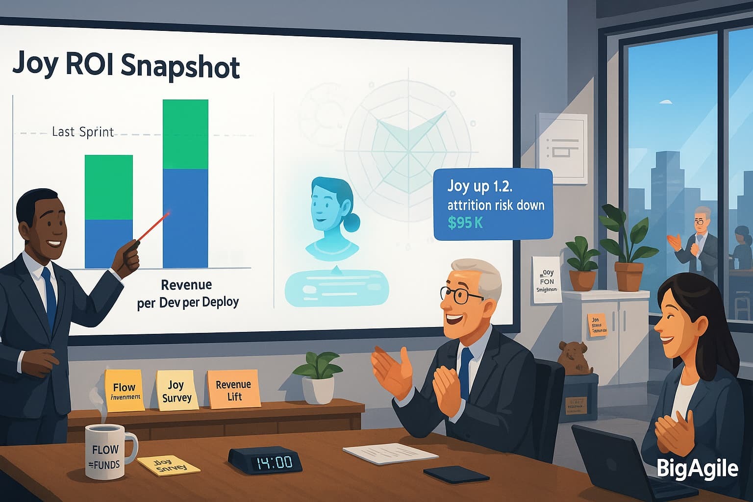
Finally, plot a two-bar graphic—attrition savings and revenue per developer per deploy—overlaying the flow radar for context. The colors (green for savings, blue for revenue) tell an immediate story, while the dotted line indicates last sprint’s baseline. Leaders can quickly see whether investing in flow experiments results in dollars saved and earned. Present this slide as the highlight of your quarterly review: it combines people, service, and profit into a clear, compelling picture.
import matplotlib.pyplot as plt
fig, ax = plt.subplots(figsize=(6,3))
ax.bar(['Attrition $ Saved', 'Rev/Dev/Deploy'], [attrition_saved, rev_per_dev_dep],
       color=['#55a868', '#4c72b0'])
ax.set_title('Joy ROI Snapshot')
plt.tight_layout(); plt.savefig('joy_roi.png')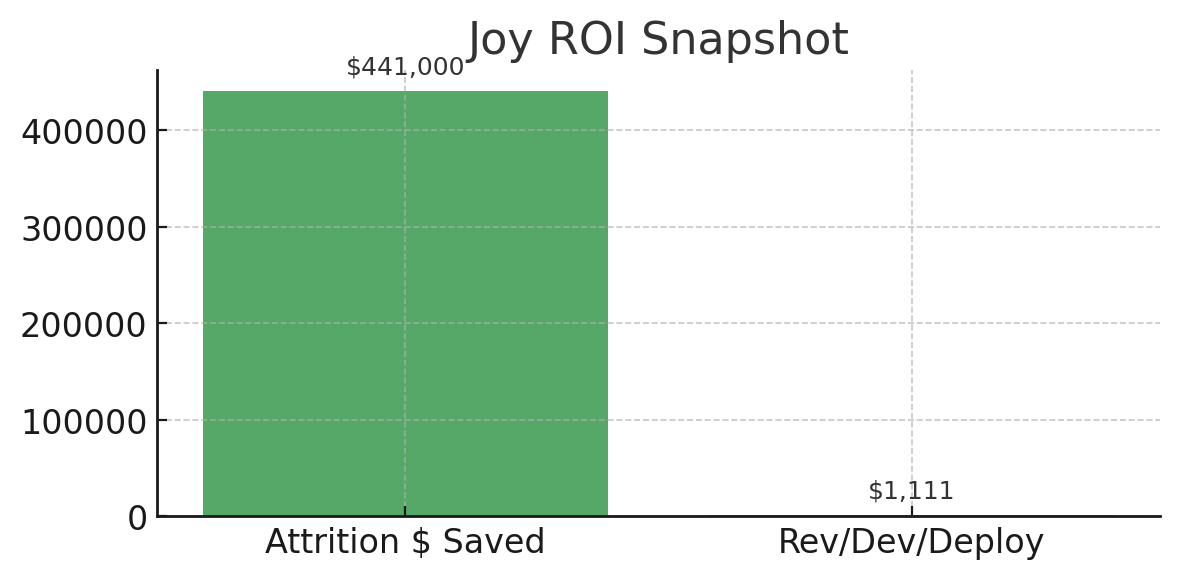
The Joy-ROI snapshot is intentionally simple: two bars, two conversations. The tall green bar: “Attrition $ Saved” ($441 K in this example), converts today’s Joy Index into actual payroll savings from retaining satisfied engineers. The shorter blue bar: “Revenue per Dev per Deploy” ($1,111), shows how much new revenue each developer generates every time code reaches production, connecting flow efficiency to revenue growth.
When presenting this to the team, start with the green bar: “Your happiness literally funds our roadmap by reducing churn costs.” Then turn to the CFO and point at the blue bar: “Every deploy now brings in over a grand, investing in faster reviews or better tooling multiplies this number.”
Review the chart each sprint; rising bars show experiments are working, while flat bars indicate it’s time for a new hypothesis.
DevEx Gathering
Open the leadership review by showing the bar chart before the numbers: ask directors to guess which investment, flow automation or culture work, drove the bigger lift. Then reveal the actual figures to create curiosity and buy-in. Close by letting engineers demo one tiny experiment that moved the Joy bar; this makes soft skills concrete and keeps funding flowing.
Impact Snapshot
| Metric | Current | Last Sprint | Δ |
|---|---|---|---|
| Joy Index | 7.0 | 5.8 | +1.2 |
| Attrition $ Saved | $95K | $0 | +$95K |
| Rev/Dev/Deploy | $3,450 | $2,800 | +$650 |
People thrive → Service shines → Profit follows. Thanks for riding the Flow-to-Joy series—now go turn data into delight.
Wrapping Up
From Sunday’s “are-we-fast-and-fulfilled” review-wait audit to today’s Joy-ROI pitch, we followed one core idea: flow is the engine, joy is the fuel, profit is the by-product. We identified bottlenecks in pull-request queues, built platform roads to reduce yak time, mapped idea-to-cash value streams, and demonstrated that blameless metrics foster psychological safety rather than fear.
By Thursday, we had a DevEx scorecard that any engineer could troubleshoot and any CFO could appreciate; on Friday, we integrated DevOps and MLOps into a single supply chain, so models no longer lag behind code. Today, we closed the loop—showing how a single point of Joy can generate $95K in churn savings and add real dollars to every deployment.
If you adopt just one approach from the series—daily flow snapshot, failure-star board, unified pipeline—you will eliminate waste that no ERP project could ever eliminate; adopt them all, and you will transform engineering from a cost center into a growing asset.
Keep tracking what matters, keep celebrating the progress you make, and remember the FedEx mantra we proudly borrowed: People thrive → Service shines → Profit follows. Thanks for spending the week with Big Agile; now go turn those charts into conversations and those conversations into velocity you can bank.
Recap Links
Intro: Why People-Service-Profit Still Wins in Software
SUN: DevEx vs DORA and Why Both Matter
MON: DevEx vs. DORA-Platform Engineering & Flow
TUE: DevEx vs. DORA-Value Stream Management
WED: DevEx vs. Psychological Safety and Metrics
THU: DevEx Experience Library
FRI: DevOps and MLOps - The Next Frontier
SAT: DevEx ROI-Engineering Impact
Ready to unify code and model pipelines? Join our AI for Scrum Master to wire alerts, dashboards, and AI-driven post-mortems in one sprint.