Flow+Joy Focus.
Turn raw Flow Radar JSON into a single DevEx scorecard so leaders, coaches, and engineers see the same seven health signals at a glance.
People → Service → Profit.
Developers thrive when bottlenecks are visible and fixable; a shared scorecard turns private pain into team goals. Clear DevEx metrics, review-wait, flaky builds, WIP age, translate directly into faster, stable releases, raising customer confidence. That confidence lowers churn and support cost, a profit the CFO can measure without reading a single log line.
Why It Matters
- Jellyfish’s research shows teams with transparent DevEx dashboards release 22% faster.
- Scorecards replace anecdotal “feels slow” with agreed-upon thresholds.
- A one-pager means less time hunting for metrics, more time moving them.
5-Step Implementation
Step 1 – Export Slack Mood Data
In Sunday’s and Monday’s posts we showed how to collect seven flow signals; review-wait, build stability, WIP-age, deploy frequency, lead-time, MTTR, mood index. Then write them to disk as a single JSON payload.
So for this step, capture a fresh snapshot of your key flow metrics in a single JSON file. This acts as the “data cartridge” you’ll reload every day, giving everyone the same ground truth.
Present it as the raw ingredient, no judgment...yet; just the facts your scorecard will visualize. We can use yesterday’s pipeline run or call the API directly. Sample file.
# File saved as flow_radar_sample.json
{
  "review_wait_avg": 42,
  "build_stability_pct": 88,
  "wip_age_p90": 3.2,
  "deploy_freq_per_week": 9,
  "lead_time_hours": 26,
  "mttr_hours": 1.4,
  "mood_index": 7
}
Step 2 – Compute Daily Mood Score
Different metrics live on different scales (percent, minutes, hours); normalizing puts them on a common footing. Inverting “lower-is-better” values (lead time, MTTR) ensures higher always means healthier, making the radar intuitive at first glance. When you showcase, explain that it keeps the chart from favoring one metric just because its units are larger. Parse JSON into a DataFrame so you can scale disparate units (hours, percentages, counts).
import json, pandas as pd, numpy as np
raw = json.load(open('flow_radar_sample.json'))
df  = pd.DataFrame(raw, index=[0])

# invert “lower-is-better” metrics so higher always = better
invert = ['review_wait_avg', 'wip_age_p90', 'lead_time_hours', 'mttr_hours']
df[invert] = df[invert].apply(lambda x: 1 / x)
Step 3 – Log Failure Wins
Assign equal weight to every metric (or tweak the dictionary to match your realities) and roll them into a 0-to-10 composite. A single headline number helps non-technical stakeholders track improvement without parsing "seven" plots. Show the formula on-screen so the method feels transparent. Sample File.
weights = {c: 1 / len(df.columns) for c in df.columns}
score   = sum(df[c] * w for c, w in weights.items()) * 10
df['devex_score'] = score.round(1)
df.to_csv('devex_scorecard.csv', index=False)
Step 4 – Visualize Mood & Failure Markers
Use matplotlib to create a radar chart plus headline score. The radar chart turns rows of numbers into an immediate shape: jagged edges show imbalance; a smooth, symmetrical polygon means healthy flow. Include the headline score in the title and color segments red (<4), amber (4-7) or green (>7) to focus conversation. Drop the PNG into Slack or Confluence so remote team-mates see the same picture you discuss in the daily huddle.
import matplotlib.pyplot as plt, numpy as np
labels  = list(raw.keys())
values  = df.iloc[0][labels].values
angles  = np.linspace(0, 2 * np.pi, len(labels), endpoint=False).tolist()

# close the radar loop
values  = np.concatenate((values, [values[0]]))
angles += angles[:1]

plt.figure(figsize=(6, 6))
ax = plt.subplot(111, polar=True)
ax.plot(angles, values, 'o-', linewidth=2)
ax.fill(angles, values, alpha=.25)
ax.set_thetagrids(np.degrees(angles[:-1]), labels)
plt.title(f"DevEx Scorecard – {df['devex_score'][0]}/10")
plt.tight_layout()
plt.savefig('devex_radar.png')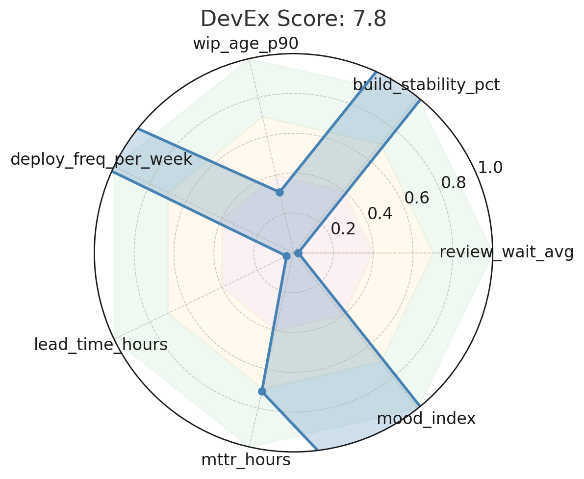
How to Read This DevEx Radar
- Shape > Score: A healthy team draws a near circle, even with full spokes in all directions. Dents or skinny spokes mark hidden drag. In our chart, the Review-Wait, Lead-Time, and MTTR spokes are noticeably shorter—those are the first friction points to attack.
- Color & Fill: The filled green/amber/red area allows instant heat-mapping. Anything red (< 4 / 10 after normalization) means work routinely waits or fails in that slice of the stream; amber (4-7) is watch-list territory.
- Upper Right Legend: Values are normalized, so don’t worry that Build-Stability shows 0.88 while Lead-Time shows 0.038—they’re already scaled. Bigger = healthier across the board.
- Composite Score (title): 7.8 / 10 is respectable but not high-performing. Most high-performing teams we coach score≥ 8.5; anything under 7 usually hides morale or debt problems (before normalization it was 150.1). Lower is better.
- Colors
- Red zone touches: Lead-Time and Review-Wait spokes dip into red; they’re your first targets.
- Amber dents: WIP Age sits cautiously; focus there once red zones lift.
- Green spans: Build stability, deploy frequency, mood, MTTR, and land safely; keep guarding them as you fix the weak spokes.
- Good
- Broad, symmetrical polygon touching ≥ 0.8 on every spoke.
- Composite score > 8.5 sustained for three sprints.
- The trend line on each underlying metric is moving upward or holding steady.
- Concerns
- A “star-fish” with two or more spokes < 0.3—common sign of hero bottlenecks or flaky infra.
- Composite score yo-yoing > 1 point sprint to sprint (process instability).
- One spoke grows while its neighbor shrinks—improvement achieved by robbing another phase.
Step 5 – Share & Celebrate
Pin the image in #team-health and agree on one amber or red spoke to lift by the next retro. Log before/after values in the same CSV to prove impact. Each time the composite score bumps a full point, celebrate, then pick the next weakest spoke and keep the virtuous cycle rolling. Agree on one metric <8/10 to improve by next retro.
// File: flow_radar_sample.json (see Step 1 for contents)DevEx Gathering
Open the retro by asking, “Which spoke hurts the customer most?” Give each dev two votes; the highest-voted metric becomes the sprint experiment. Link the change to profit: cutting review wait, 20% returns two extra deploys per week. Re-score next retro; visible improvement builds trust and fuels the next cycle.
Scorecard Snapshot
| Metric | Raw Value | Normalized |
|---|---|---|
| Review-Wait Avg | 42 min | 0.024 |
| Build Stability | 88 % | 0.880 |
| WIP Age P90 | 3.2 d | 0.312 |
| Deploy Frequency | 9/wk | 0.900 |
| Lead Time | 26 h | 0.038 |
| MTTR | 1.4 h | 0.714 |
| Mood Index | 7/10 | 0.700 |
Recommendations for This Team (could use LLM to suggest these too)
- Cut Review-Wait: auto-assign a secondary reviewer and enforce PR < 300 LOC; target 20 min average.
- Shrink Lead-Time: blend trunk-based commits with nightly canary deploys to shave at least 6 hours.
- Lower MTTR: introduce a “fix-forward” playbook and ensure every incident writes a one-line run-book entry.
Re-score in one sprint; if the polygon rounds out and composite pushes past 8, shift focus to WIP age or sentiment to maintain balance.
People thrive → Service shines → Profit follows. See you tomorrow for DevOps meets MLOps.
Recap Links
Intro: Why People-Service-Profit Still Wins in Software
SUN: DevEx vs DORA and Why Both Matter
MON: DevEx vs. DORA-Platform Engineering & Flow
TUE: DevEx vs. DORA-Value Stream Management
WED: DevEx vs. Psychological Safety and Metrics
THU: DevEx Experience Library
FRI: DevOps and MLOps - The Next Frontier
SAT: DevEx ROI-Engineering Impact